“Snowcrash” Retail Flows & Patterns
Investor • Fintech • Figma • Prototype
SUMMARY
- The Snowcrash site needed to serve as full web3 consumer space, all while leaving a strong brand impression
- The exclusive debut NFT drop would coincide with the site launch, amping up the pressure within tight deadlines
MY ROLE
UX designer, collaborating closely with: product manager, development team
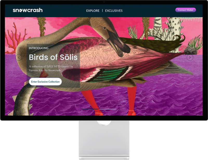
Snowcrash was a new contender in the NFT space, backed by and catering to musicians
Snowcrash was a new NFT platform backed by Jesse Dylan, with the hope of catering to musicians, visual artists, and corporate clientele. The website needed to provide an intuitive experience for newer crypto consumers while still appealing to a web3-familiar audience.
I needed to establish full e-commerce flow and associated specs and components guide for developer handoff
Early days on this project involved research in the space: review of design interactions and patterns by leading web3 platforms; validation against popular e-commerce and financial services platforms; and diving into the music and related collateral merch and auction sites. For the MVP launch, my product manager and I deliberately chose the consumer as our main user, as the enterprise clients would receive much more hands-on pitches.
MVP user flows included: new user registration, purchase of NFT items from artists, and browsing/purchase from the secondary sale market
- The standard for web3 is to use wallet login as a key identifier. The level of user verification (i.e. KYC) needed for a collection depending on the compliance requirements of the selling artist/client.
- Closely tied to the login flow is the purchase flow. A dynamic element of these pages includes the practice of presales and public sales, and users needing to claim “allow list” tokens where applicable.
- We knew wallet login would be a crucial requirement for many consumers, yet I also wanted to highlight the availability of email login coupled with fiat payments, made easily available within the “purchase” button interaction.
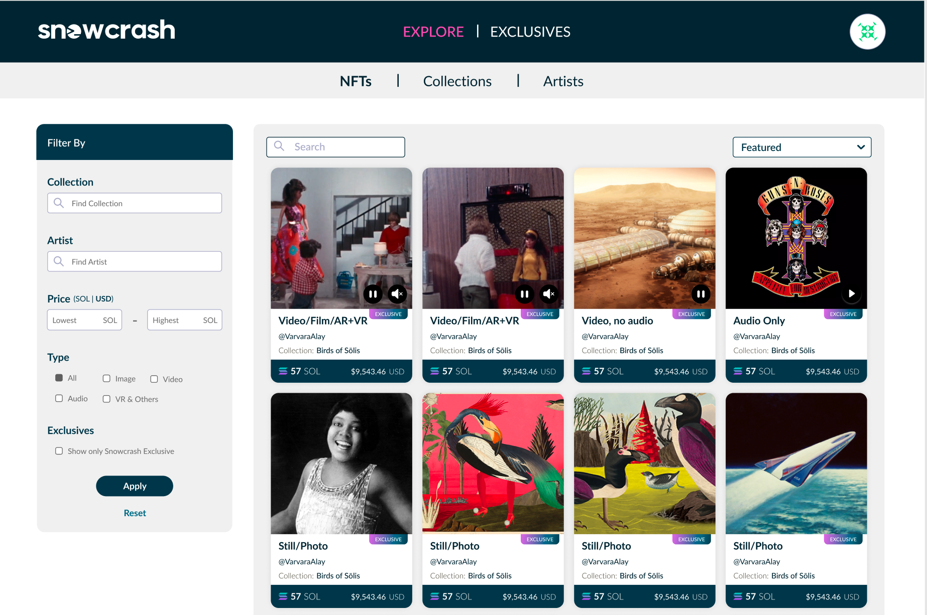
- In addition to initial public sale, users could buy on a resale market, which focused on a product listing page instead of the artist’s branded landing page. Additionally, users would themselves be able to list their own purchased items for resale.
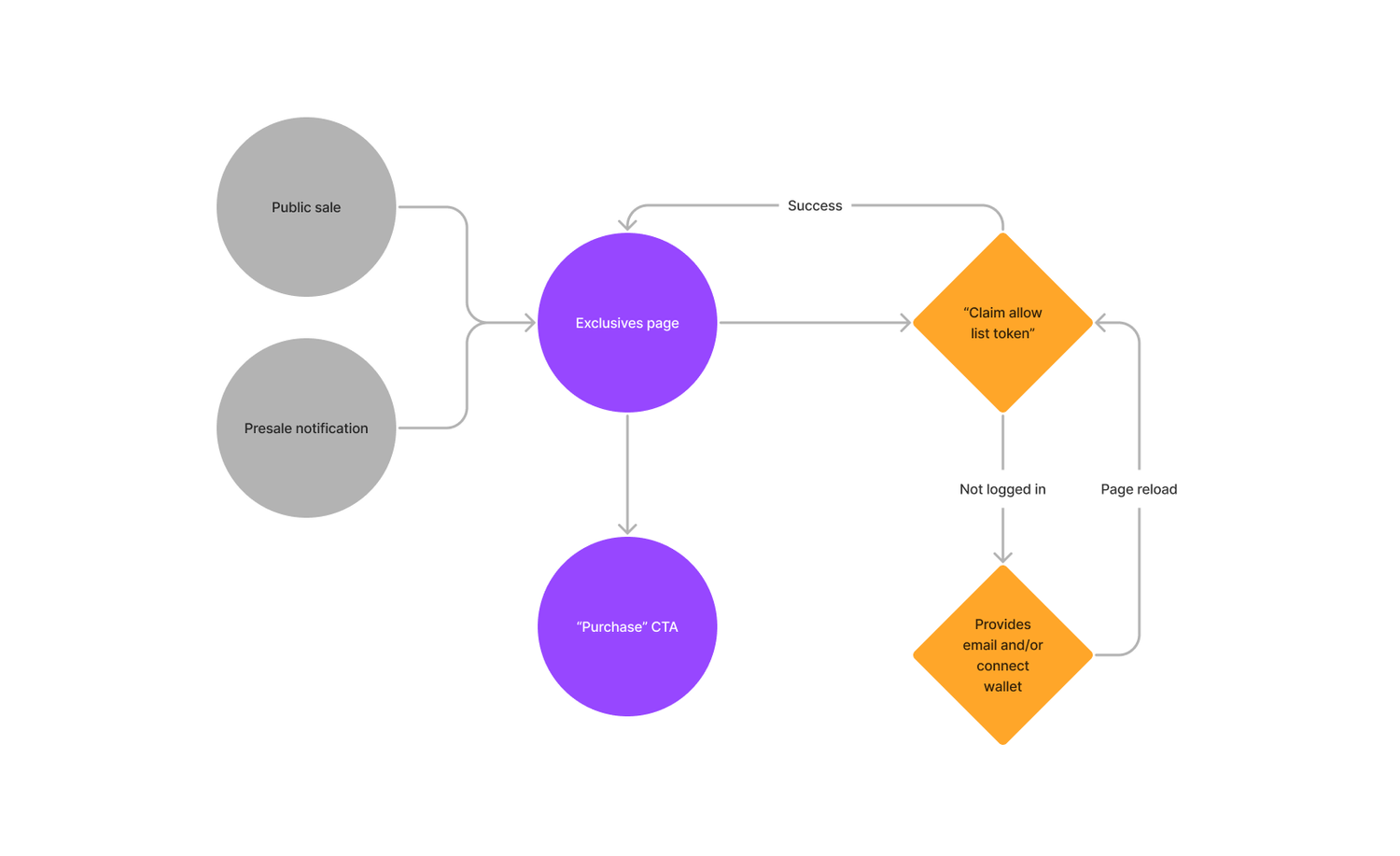
Presale and allow list flow
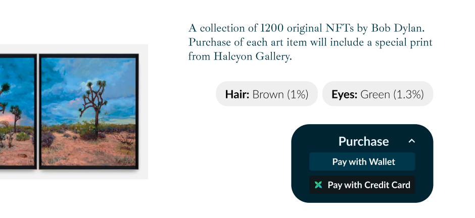
Combined wallet and fiat payment availability
In addition to initial public sale, users could buy on a resale market, which focused on a product listing page instead of the artist’s branded landing page. Additionally, users would themselves be able to list their own purchased items for resale.
The full NFT marketplace needed act distinct from any specially-timed artist drops
Can’t forget the style and spec guide
While MVP demanded quick production without a fully determined design system, I worked closely with two of our front end developers to make the component library and all hand-off elements easily inspectable, along with a simple guide that could live outside of Figma for quick reference of styling and spacing layouts on an 8-pixel grid.
The component library and resulting reference guide ended up being used across the communications team in their marketing assets, in addition to laying the groundwork for a more dynamic code library.

Quick reference guide for handoffs and collaborating
Post-launch learnings
While I didn’t have insight into the much-anticipated launch, I gleaned in conversation that the debut NFT collection with the flagship artist had not sold out within the first week, while other similar collections from competitor sites had.
As a contracted designer, it’s difficult to say where the “fault” lies, especially within the mad dash to MVP. On my end, I wish we could have invested much more time with usability testing, to ensure the purchase and resale process was as seamless as intuitive as hoped. I think everybody benefits when there’s a culture of being agile with iterating on user feedback, and I hope I can continue to recommend quick, low-cost ways to get a pulse check on consumer interest and habits.
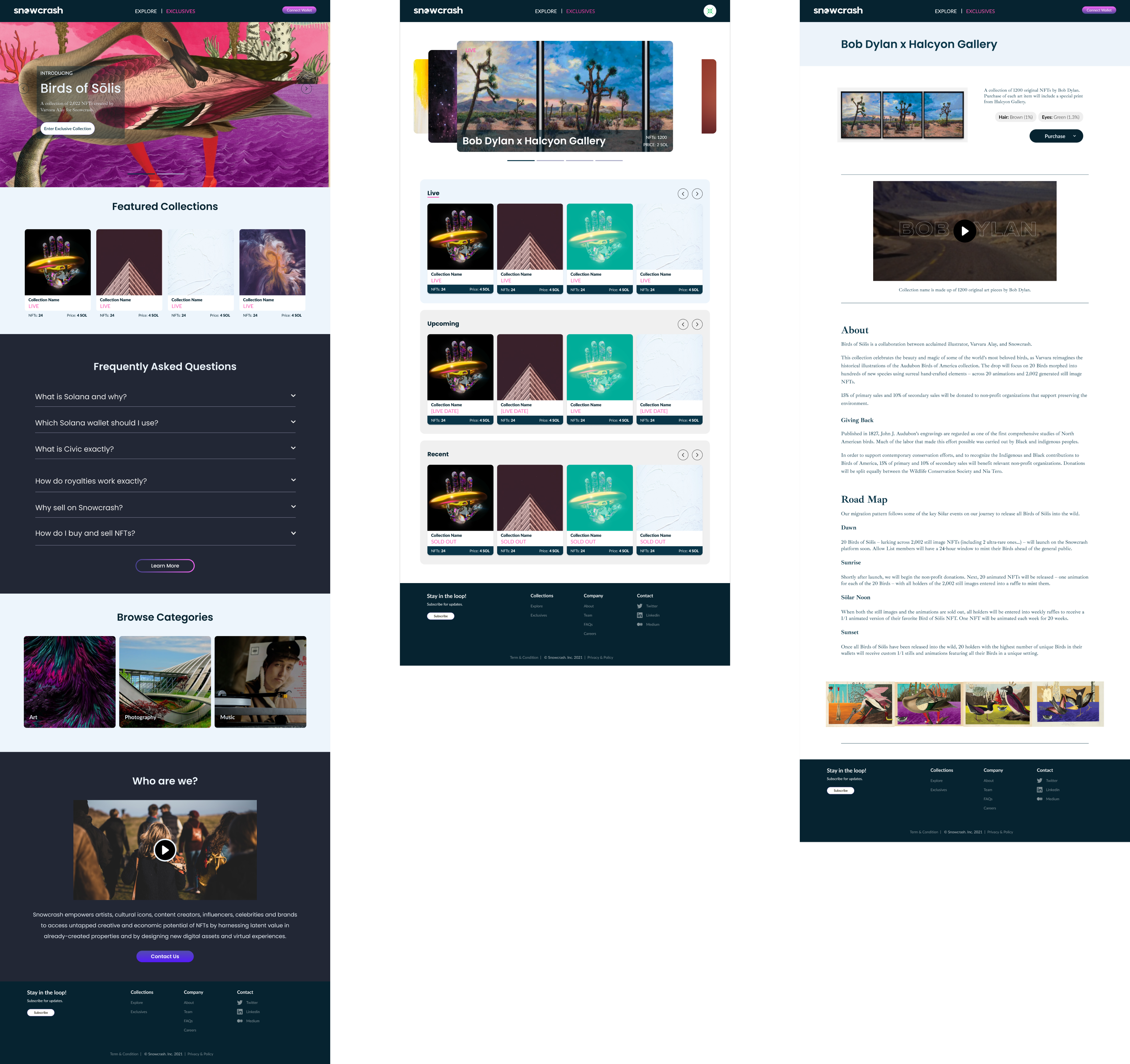
The final site design highlighted the visuals of each artist’s offerings as much as possible