Group Management in Wove CRM
SaaS • Fintech • Figma • Prototype
SUMMARY
- Financial advisors were trying to organize their clients across software programs and getting confused in the process
- Clearer paths from the get-go coupled with e-commerce patterns tested positively for clients in beta
MY ROLE
Lead designer, collaborating with: design leadership, multiple product leads, and devs
Streamlining client organization in Wove’s native CRM for more efficient workflows
Wove is a wealth management operating system created for financial advisory firms and their varying individual teams. The majority of the end users are comprised of financial advisors, who proudly work in a relationship-oriented way with specific client scenarios in mind.
Our in-house research team found that no matter the size of an advisor’s clientele list (commonly referenced as their book of business), they still tended to start from a personalized perspective--even saying they were “client-focused” before they were “account-focused.”
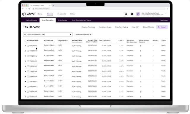
Jumping in between separate programs confused advisory staff and extended the new client process
The concept of “Groups” was preexisting in the legacy wealth management platform, NetX360. It was introduced as a simple way to organize clients ahead of initiating workflows in that platform. However, these legacy Groups had surfaced some user problems:
- Group creation was confusing, and searching for and finding the correct accounts was tedious.
- Since finding the Group could be just as difficult as creating, the users that didn’t abandon the process were left to create entirely new Groups, often with overlapping accounts and even functions.
- Multiple back-end systems were used for initial data input. Wove as a new platform needed to serve as a reliable integration between the hundreds of data points that would comprise client Groups, and this all needed to be understandable and navigable to the user.
Simplifying the required upfront data
To assist with creating new Groups, I decided to reduce the number of decisions the user would have to immediately make. After speaking to multiple product counterparts (who had reviewed related customer service trouble tickets themselves), I confirmed the bare bones of a Group required only a name and system category to correlate with 2-3 appropriate form fields.
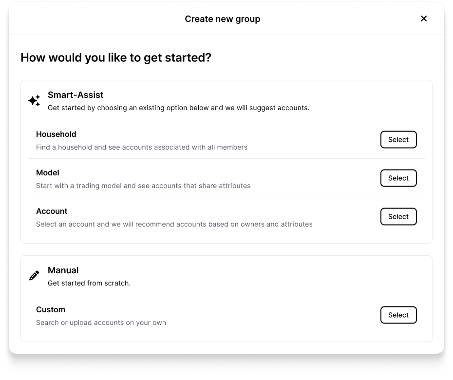
The Groups that advisors were likely to use were centered around Households (clients and their families), Financial Models, and Account types
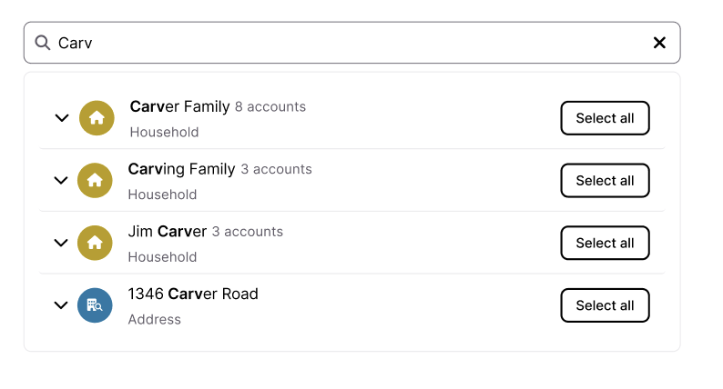
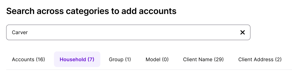
Using “add to cart” patterns for immediate understanding
To assist with the account search flows, I mimicked a basic e-commerce style “search” and “add to cart” flow to search across parameters, select accounts, and review before confirmation. While the system would allow empty Groups to be created, I wanted to surface this path to users quickly to help provide more context once they searched for this Group later.
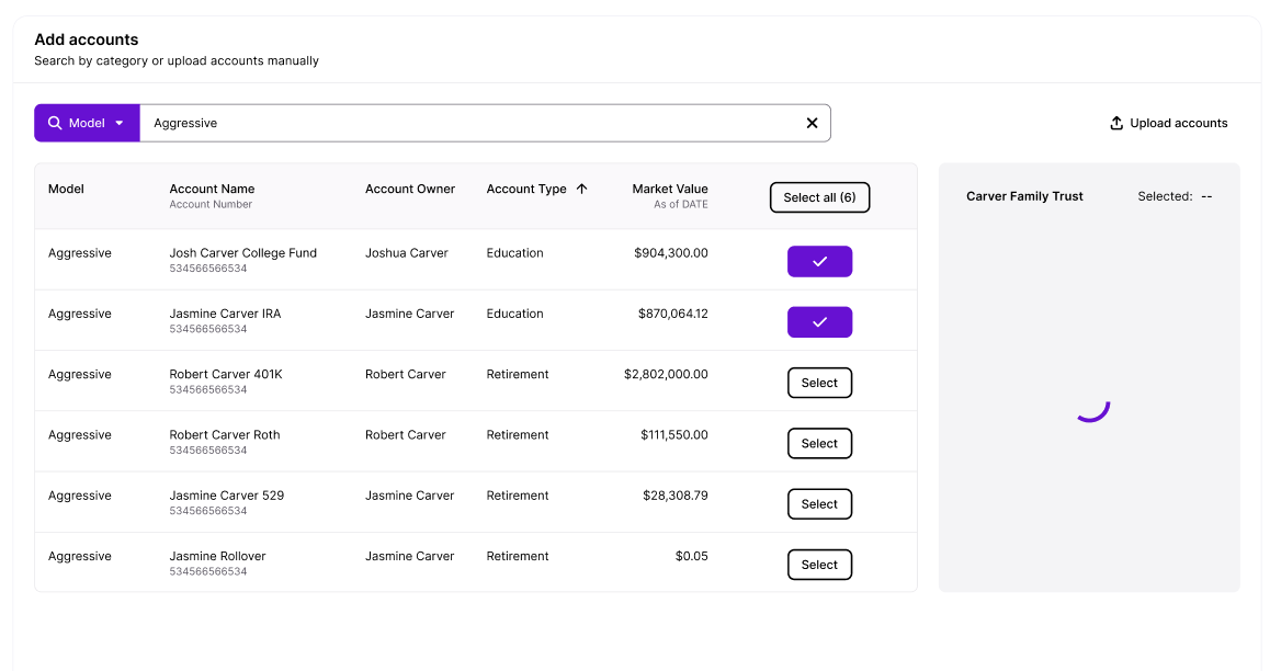
Showing the search results alongside a “selected” counter in a cart-like element provided the feedback that had been missing in legacy programs
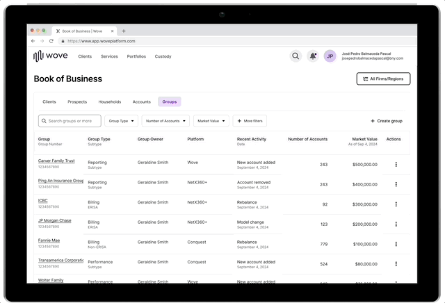
Making a Group findable by aligning with platform “profile” pages
To align with the rest of the platform, the larger design team decided that Groups and other related entities would now have a “profile” page. Besides reinforcing the client-centric mental model, this would allow for easier exploration and recall through the breadcrumb IA in the top ribbon.
To solve for the varying amounts of data that could be displayed in a potentially overwhelming way, I opted to use a view selector that would show specific or all data column views upon request. Once account and market value data was available, then the page would also be populated with the data visualizations that were now familiar from Client pages.
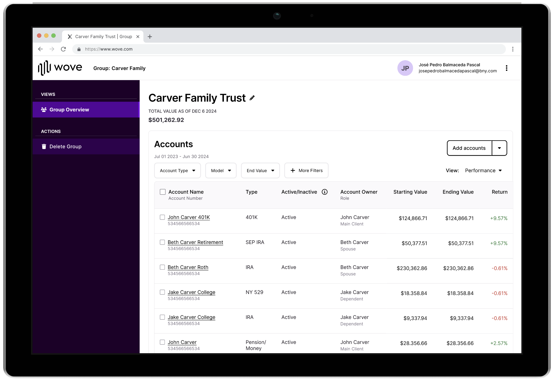
The Household Group could now have a repository of sorts where all the family members’ data could be viewed together
Trade-offs & Takeaways
In trying to tackle and craft an evergreen Group setup, I had to recognize that we were designing for an MVP product based off of a majority use case.
While I had pushed for a broad global search of different data types for the user to pull from, the engineering team stated they simply could not support such a dynamic search with our deadlines and have a reasonable load time.
Another requirement from product entailed Groups being duplicable, as duplicates were easier for customer service reps to locate than brand-new empty Groups. I had proposed a constraint that wouldn’t even allow empty Groups to proceed to creation, but my director (probably correctly) decided that making success even more complicated was riskier than allowing more empty Groups to float around in the system.
If I were able to revisit the work in future, I’d like to further refine workflows for finding and favoriting specific Groups. For instance, allowing user to conduct a smart search/chat with AI agent on finding the client with the daughter named Kelly who is nearing college age. I’d also want the Book of Business or Wove home page to show pinned Group/Client pages to help with expediency so the user wouldn’t have to rely on browser bookmarks.
Multiple iterations on a global search that could instantly parse through all data types proved to be a technical hurdle for the current system
Initial client feedback for the beta version have been positive towards key areas, with the final review page of shopping cart specifically called out favorably
If I were able to revisit the work in future, I’d like to further refine workflows for finding and favoriting specific Groups. For instance, allowing user to conduct a smart search/chat with AI agent on finding, say, that client with the daughter named Kelly who is nearing college age. I’d also want the Book of Business or Wove home page to show pinned Group/Client pages to help with expediency so the user wouldn’t have to rely on browser bookmarks.
One area of user confusion remained for the ill-defined “Custom” group; the main sentiment was simply not understanding the purpose of making an undefined group. This appeared to affirm that asking for a Group type upfront as one of the few requirements helped to give users structure to imagine the value add.
As guessed, several users wanted more AI assistance in the creation of the Group so that they wouldn’t have to learn about the details of each Group type but still benefit from having it. It’s early days, but I’m hopeful that Groups will serve to support financial advisors as they speedily work and try to consider both pressing and long-term strategies for their clients.