SANDAG “Regional Plan” Site Redesign
User flows • UI • Accessibility
SUMMARY
- The Regional Plan is required to be publicly disseminated all across San Diego county
- Even though sharing it online was a step forward, making it easier to navigate and read as a standard instructive site was the next hurdle
MY ROLE
Lead designer, collaborating with multiple product leads and dev manager
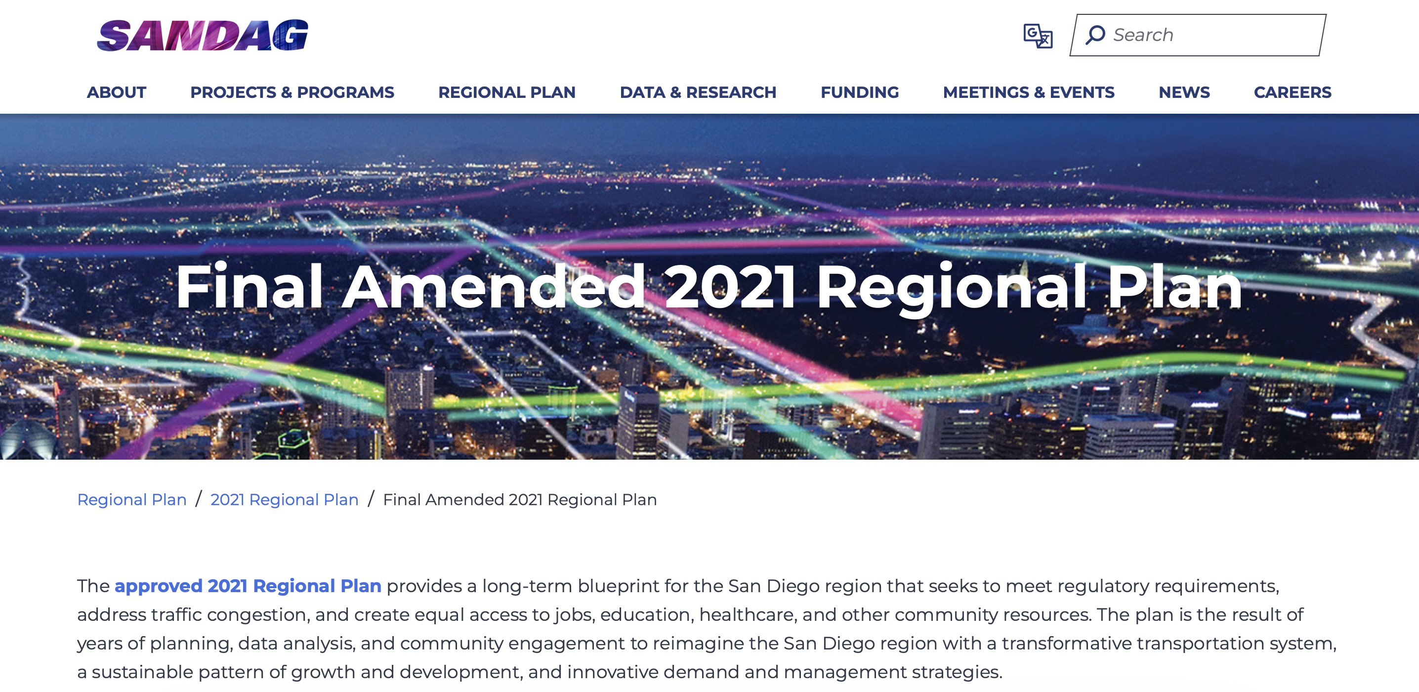
The state-mandated Regional Plan report needed transparency on all fronts
Wove is a wealth management operating system created for financial advisory firms and their varying individual teams. The majority of the end users are comprised of financial advisors, who proudly work in a relationship-oriented way with specific client scenarios in mind.
Navigation was unnecessarily opaque
As the San Diego Forward site was going to be heavily advertised to residents across the county for the updated report’s reveal, the site needed to provide intuitive user flows to help guide the broad demographics of the region find the information they wanted.
Quick usability tests were conducted internally with staff that were not involved with the Regional Plan report or the site build. Most staff spent a lot of time scrutinizing each navigation option and its nested page titles. When they were able to find the page they were looking for, the content was densely packed into the viewport, causing visibility and comprehension issues.
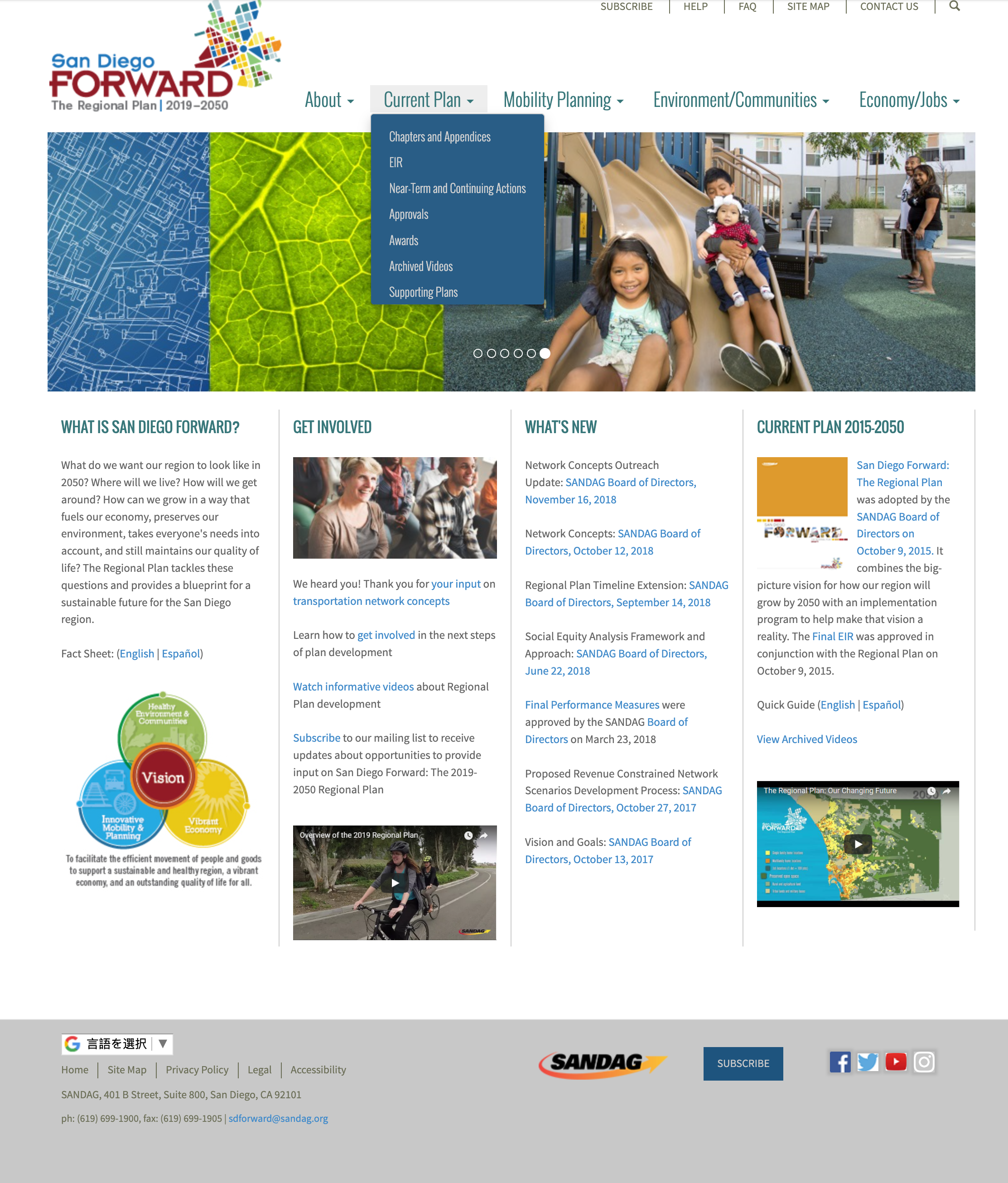
Previous San Diego Forward site (circa 2018) proved to be dense and confusing for readers
How can we make complex studies and projects more accessible?
The goals for the redesign became to:
- Refine content categories and descriptive labels for an intuitive user flow
- Update copy and contrast for broader visual accessibility
- Create responsive designs for different device sizes
- Update the visual styling to include newer SANDAG brand styling
Consumer-friendly information is more accessible to all
My practical solutions involved heuristics and accepted practices for how readers consume content online. The character limit for each line needed to be reduced, along with the number of columns in the page. And the color palette could be reduced to the primary brand colors and plain black and white.
These adjustments, simple as they were, along with bringing each page into ADA compliance, made the site look more trustworthy and regularly maintained.
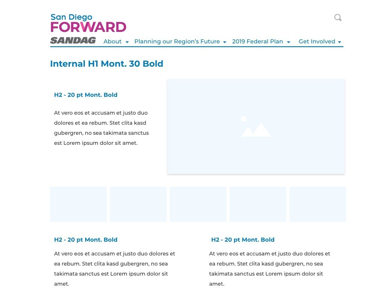
My site redesign reflected an eye towards semantic code, ADA-compliance, and clean readability for the public
Further revisions I’d like to explore
There’s a fine balance between surfacing pertinent information for the public and overloading them. Though most elements of my designs were deployed for the Regional Plan site, I did not plan well for the hundreds of potentially relevant documents that SANDAG would be sharing across the site.
If given the opportunity, I’d spend time designing a searchable document repository, and create a “featured” articles area where only a few documents could be suggested or highlighted to the reader.