Landing Pages for Finance of America Reverse

User flows • UI • Analytics • Hubspot
An illustrative sketch of a flower

SUMMARY

  • Lead generation with landing pages had historically been unsuccessful in the company, partially due to time and effort
  • Using analytics and internal research, I created a series of landing pages that led to an increase in quality leads

MY ROLE

UX designer, collaborating with: brand marketing designers, search engine marketer

Creating a new lead-gen avenue through design

The Finance of America Reverse (FAR) Marketing team required designs for a campaign of dynamic landing pages targeting their consumers. If successful, these landing pages would serve as the baseline for lead generation numbers, as well as the design template for future campaigns.

Previous landing pages had been outsourced and were not deemed successful

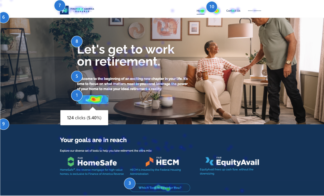
One of the major issues I came up against was being unable to re-use any of the previous landing pages. On a technical level, the existing pages were also individually hard-coded by developers in Wordpress on an ad hoc basis. These layouts also weren’t necessarily built to be responsive across devices, so some confusion or missed clicks resulted.


These landing pages had also averaged only around 3-6% conversion, lower than industry standards.

The products could be polarizing

I reviewed existing research on FAR’S customers, seizing on specific mindsets toward the reverse mortgage loan products, including: anxiety towards preserving and/or improving their quality of life; fearing the bank would seize their home; or dislike for the “last resort” emotion that this loan product could convey.


With this as context, I determined that the landing pages needed to immediately appear soothing and assuring to consumers. Rather than creating an obviously “lead gen” page with a long-winded pitch, I opted to create a “microsite” with navigation and link styling similar to the main brand site to booster visual continuity and brand recognition.
An illustrative sketch of a flower

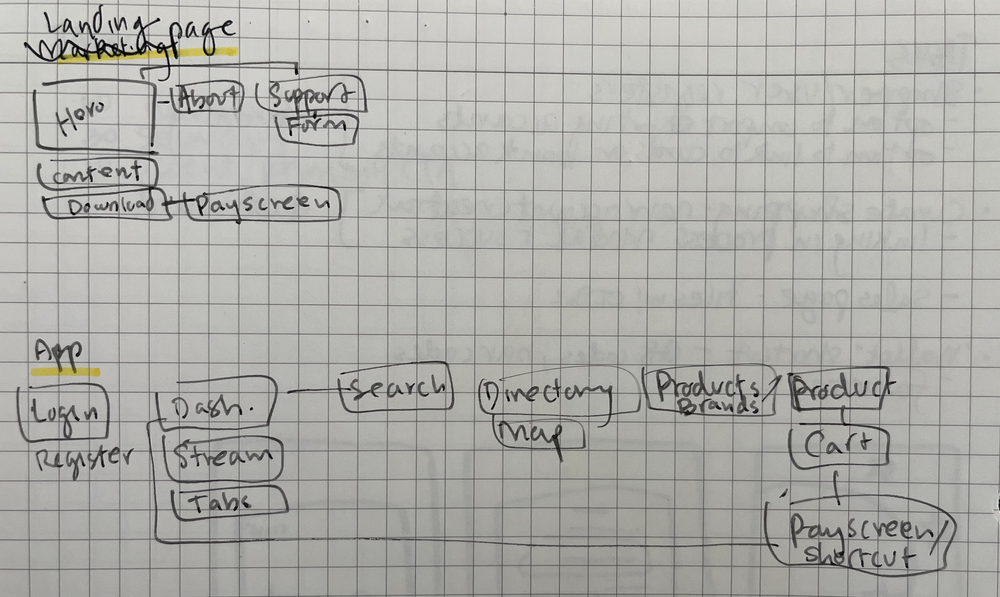
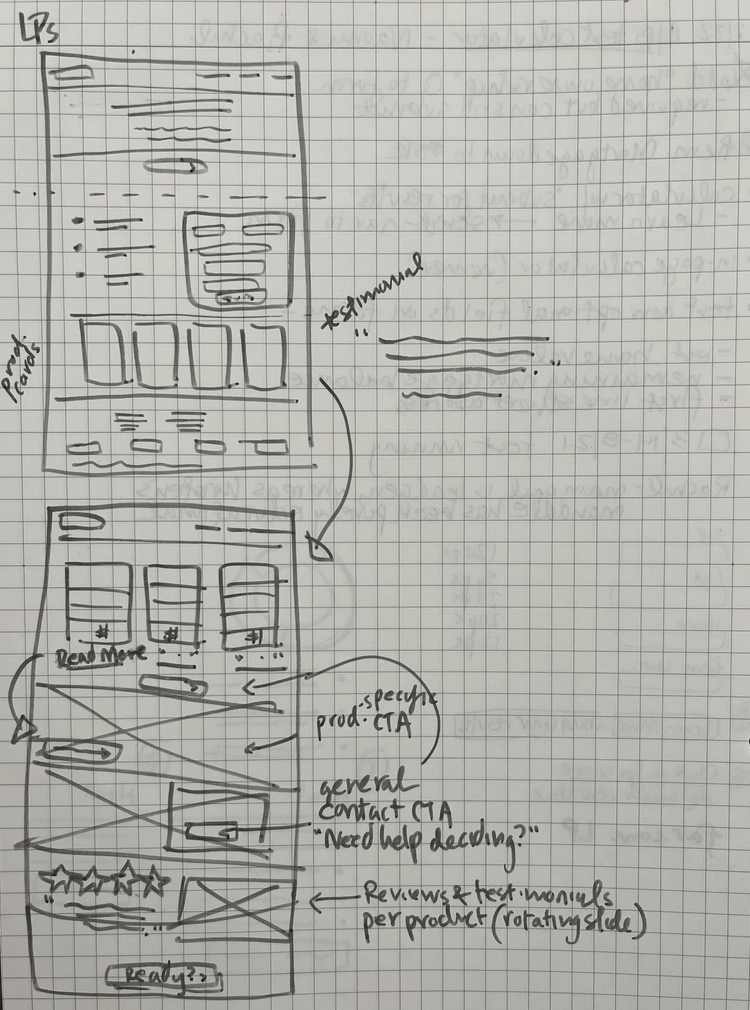
Sketches were a quick way to show my thought process to the broader team and validate that the intended user journey was correct

Other generative research included review of the most up to date industry standards for landing pages across devices and browser types. This helped to provide a target range for each page’s conversion rate.

Collaborating across every team for this big push

An illustrative sketch of a flower

Product logos, brand colors, disclaimer copy, and other assets each needed to be sourced to align with brand expectations

In this stage, I worked with the brand designers to source the correct assets for the pages; spoke to directors and project managers regarding the most important value proposition for each product or campaign; and confirmed with the brand copywriting team that my original copy and UX writing from these conversations was on-brand and accurate

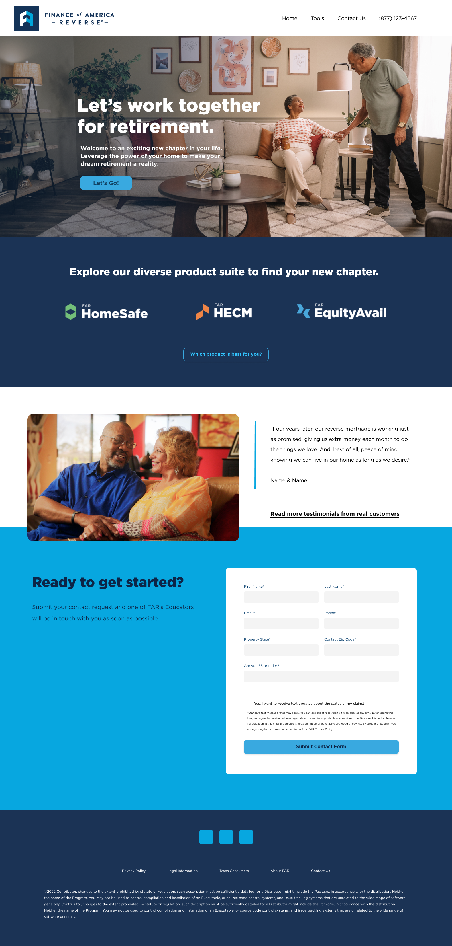
I then worked with our search engine marketer as a way to validate my lo-fi sketches. From those conversations, I determined the best way to funnel potential leads from search engine should include “hiding” the main Contact form, requiring a scroll to the bottom of the home page or to click the main CTA on the home page. This way, the form content could get cached in search but it would not be the immediate thing users were presented with if they followed the main flow from ads.


With all this, I created mockups of several templates in Figma, presented to brand team for feedback, and then directly created the pages using Hubspot tools.
An illustrative sketch of a flower

I produced multiple variations and combinations of landing pages to help emphasize different products’ values

Results showed that the pages I designed exceeded all previous conversion rates on similar landing pages
An illustrative sketch of a flower

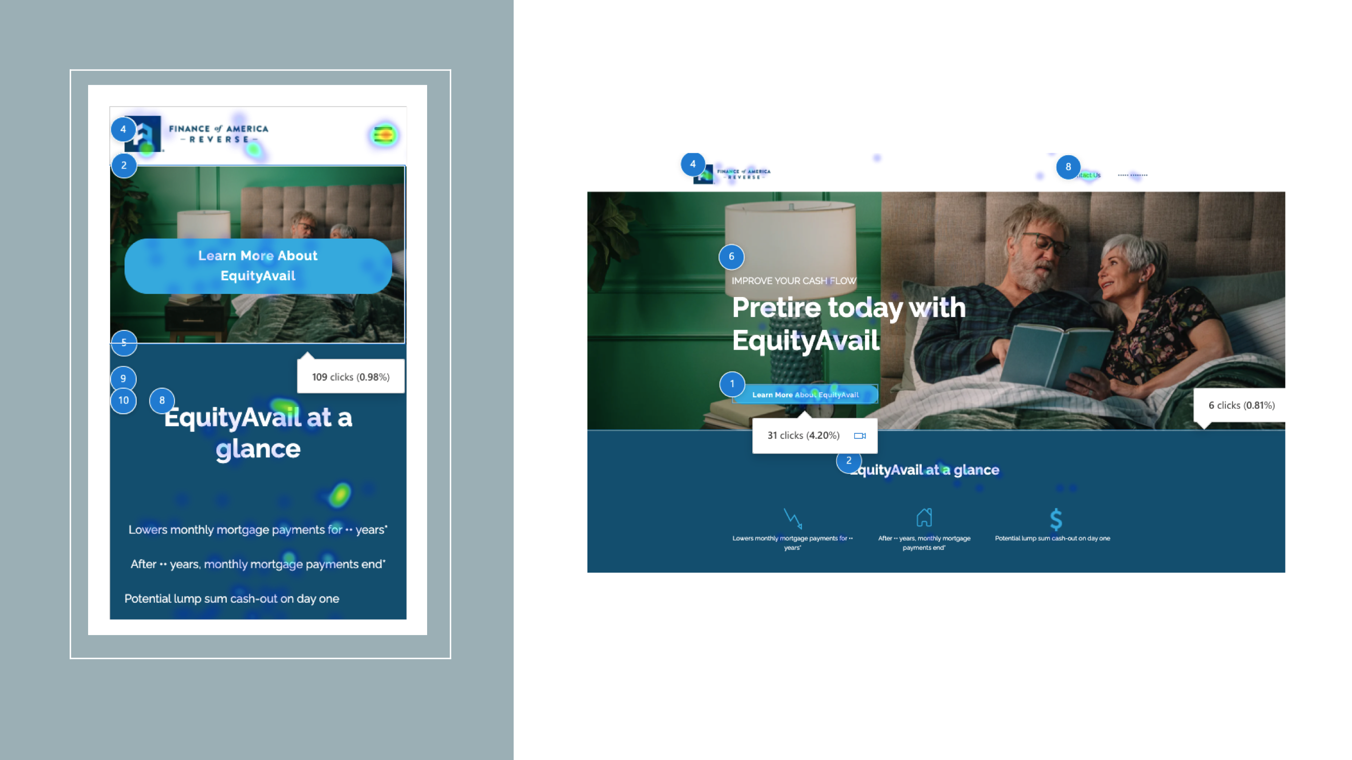
The Hubspot landing pages were meant to serve as a baseline for beginning to measure metrics as well as in-page behavior. Data and behavior review showed us where the immediate successes were:

  • Most importantly, new quality leads were coming in regularly and at a high conversion rate on top-performing pages (6.94% - 13.06%)
  • Because we weren’t waiting on Wordpress sites to be hard-coded, I was able to work with the marketing team to create fresh or relevant content more frequently
  • The built-in analytics made reporting in real time much smoother, which helped for my fast-paced testing and iterating


With this initial campaign deemed an immediate success, with conversion and contacts surpassing any previous landing page performance, more budget was able to be allocated to building landing pages and with additional customized layouts from in-house developers.
product designer specialized in fintech, SaaS, CRM

Landing Pages for Finance of America Reverse

User flows • UI • Analytics • Hubspot

An illustrative sketch of a flower

Creating a new lead-gen avenue through design

The Finance of America Reverse (FAR) Marketing team required designs for a campaign of dynamic landing pages targeting their consumers. If successful, these landing pages would serve as the baseline for lead generation numbers, as well as the design template for future campaigns.

SUMMARY

  • Lead generation with landing pages had historically been unsuccessful in the company, partially due to time and effort
  • Using analytics and internal research, I created a series of landing pages that led to an increase in quality leads

MY ROLE

UX designer, collaborating with: brand marketing designers, search engine marketer

Previous landing pages had been outsourced and were not deemed successful

One of the major issues I came up against was being unable to re-use any of the previous landing pages. On a technical level, the existing pages were also individually hard-coded by developers in Wordpress on an ad hoc basis. These layouts also weren’t necessarily built to be responsive across devices, so some confusion or missed clicks resulted.


These landing pages had also averaged only around 3-6% conversion, lower than industry standards.

The products could be polarizing

I reviewed existing research on FAR’S customers, seizing on specific mindsets toward the reverse mortgage loan products, including: anxiety towards preserving and/or improving their quality of life; fearing the bank would seize their home; or dislike for the “last resort” emotion that this loan product could convey.


With this as context, I determined that the landing pages needed to immediately appear soothing and assuring to consumers. Rather than creating an obviously “lead gen” page with a long-winded pitch, I opted to create a “microsite” with navigation and link styling similar to the main brand site to booster visual continuity and brand recognition.

An illustrative sketch of a flower

Sketches were a quick way to show my thought process to the broader team and validate that the intended user journey was correct

Other generative research included review of the most up to date industry standards for landing pages across devices and browser types. This helped to provide a target range for each page’s conversion rate.

Collaborating across every team for this big push

An illustrative sketch of a flower

Product logos, brand colors, disclaimer copy, and other assets each needed to be sourced to align with brand expectations

In this stage, I worked with the brand designers to source the correct assets for the pages; spoke to directors and project managers regarding the most important value proposition for each product or campaign; and confirmed with the brand copywriting team that my original copy and UX writing from these conversations was on-brand and accurate

I then worked with our search engine marketer as a way to validate my lo-fi sketches. From those conversations, I determined the best way to funnel potential leads from search engine should include “hiding” the main Contact form, requiring a scroll to the bottom of the home page or to click the main CTA on the home page. This way, the form content could get cached in search but it would not be the immediate thing users were presented with if they followed the main flow from ads.


With all this, I created mockups of several templates in Figma, presented to brand team for feedback, and then directly created the pages using Hubspot tools.

An illustrative sketch of a flower

I produced multiple variations and combinations of landing pages to help emphasize different products’ values

Results showed that the pages I designed exceeded all previous conversion rates on similar landing pages

An illustrative sketch of a flower

The Hubspot landing pages were meant to serve as a baseline for beginning to measure metrics as well as in-page behavior. Data and behavior review showed us where the immediate successes were:


  • Most importantly, new quality leads were coming in regularly and at a high conversion rate on top-performing pages (6.94% - 13.06%)
  • Because we weren’t waiting on Wordpress sites to be hard-coded, I was able to work with the marketing team to create fresh or relevant content more frequently
  • The built-in analytics made reporting in real time much smoother, which helped for my fast-paced testing and iterating


With this initial campaign deemed an immediate success, with conversion and contacts surpassing any previous landing page performance, more budget was able to be allocated to building landing pages and with additional customized layouts from in-house developers.

product designer specialized in fintech, SaaS, CRM

Landing Pages for Finance of America Reverse

User flows • UI • Analytics • Hubspot

An illustrative sketch of a flower

Creating a new lead-gen avenue through design

The Finance of America Reverse (FAR) Marketing team required designs for a campaign of dynamic landing pages targeting their consumers. If successful, these landing pages would serve as the baseline for lead generation numbers, as well as the design template for future campaigns.

SUMMARY

  • Lead generation with landing pages had historically been unsuccessful in the company, partially due to time and effort
  • Using analytics and internal research, I created a series of landing pages that led to an increase in quality leads

MY ROLE

UX designer, collaborating with: brand marketing designers, search engine marketer

Previous landing pages had been outsourced and were not deemed successful

One of the major issues I came up against was being unable to re-use any of the previous landing pages. On a technical level, the existing pages were also individually hard-coded by developers in Wordpress on an ad hoc basis. These layouts also weren’t necessarily built to be responsive across devices, so some confusion or missed clicks resulted.


These landing pages had also averaged only around 3-6% conversion, lower than industry standards.

The products could be polarizing

I reviewed existing research on FAR’S customers, seizing on specific mindsets toward the reverse mortgage loan products, including: anxiety towards preserving and/or improving their quality of life; fearing the bank would seize their home; or dislike for the “last resort” emotion that this loan product could convey.


With this as context, I determined that the landing pages needed to immediately appear soothing and assuring to consumers. Rather than creating an obviously “lead gen” page with a long-winded pitch, I opted to create a “microsite” with navigation and link styling similar to the main brand site to booster visual continuity and brand recognition.

An illustrative sketch of a flower

Sketches were a quick way to show my thought process to the broader team and validate that the intended user journey was correct

Other generative research included review of the most up to date industry standards for landing pages across devices and browser types. This helped to provide a target range for each page’s conversion rate.

Collaborating across every team for this big push

An illustrative sketch of a flower

Product logos, brand colors, disclaimer copy, and other assets each needed to be sourced to align with brand expectations

In this stage, I worked with the brand designers to source the correct assets for the pages; spoke to directors and project managers regarding the most important value proposition for each product or campaign; and confirmed with the brand copywriting team that my original copy and UX writing from these conversations was on-brand and accurate

I then worked with our search engine marketer as a way to validate my lo-fi sketches. From those conversations, I determined the best way to funnel potential leads from search engine should include “hiding” the main Contact form, requiring a scroll to the bottom of the home page or to click the main CTA on the home page. This way, the form content could get cached in search but it would not be the immediate thing users were presented with if they followed the main flow from ads.


With all this, I created mockups of several templates in Figma, presented to brand team for feedback, and then directly created the pages using Hubspot tools.

An illustrative sketch of a flower

Results showed that my landing pages exceeded all previous conversion rates on similar landing pages

An illustrative sketch of a flower

The Hubspot landing pages were meant to serve as a baseline for beginning to measure metrics as well as in-page behavior. Data and behavior review showed us where the immediate successes were:


  • Most importantly, new quality leads were coming in regularly and at a high conversion rate on top-performing pages (6.94% - 13.06%)
  • Because we weren’t waiting on Wordpress sites to be hard-coded, I was able to work with the marketing team to create fresh or relevant content more frequently
  • The built-in analytics made reporting in real time much smoother, which helped for my fast-paced testing and iterating


With this initial campaign deemed an immediate success, with conversion and contacts surpassing any previous landing page performance, more budget was able to be allocated to building landing pages and with additional customized layouts from in-house developers.