Values Spending App
Investor • Fintech • Figma • Prototype

SUMMARY
- The external financial planning app Conquest would provide the “engine” for a retail investor portal, while the Wove team would determine UX and visual experience
- The quick design turnaround I gave was significant for this multi-party partnership with USAA and Conquest
MY ROLE
Studio designer, collaborating with: lead designer, product manager
Bridging the gaps between an external planning engine and a consumer portal
The financial planning program Conquest was going to be used as a bridge between our client USAA and their banking clients. By integrating Conquest into Wove, an advisory platform, USAA advisors would be able to use their full suite of tools while showing their own retail clients a synced investor portal.
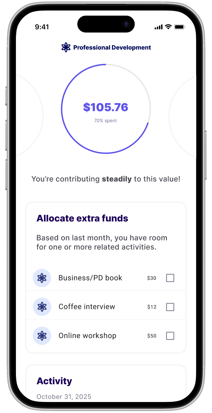
I used my own experience as a retail investor to determine the most likely data that could generate a progress chart: income, cash saved, frequency of deposits, and risk tolerance. I validated these data points with my product counterpart, who confirmed that those points are necessary to generate any sort of projection with a financial model.
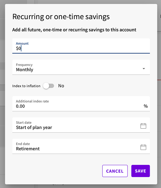
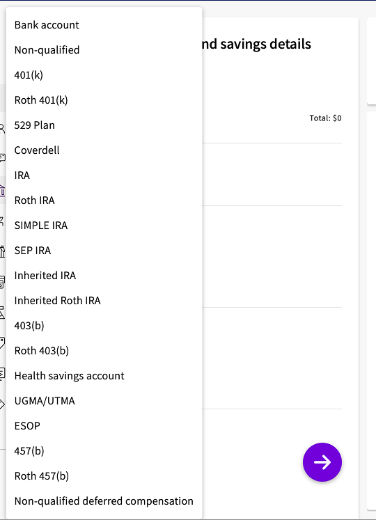
With this knowledge in hand, I tallied the new required onboarding screens to only three short pages, with a total of six data points among them. The original experience hovered closer to around 40 different required form fields. By substantially reducing this level of absolutely required data, we theorized we could alleviate the high risk of drop-off.
I also made specific content recommendations, including the type of language and the built-in numerical scoring around the client’s financial “health” and viability of accomplishing their goals. I reasoned that getting a seemingly arbitrary percentage score was unlikely to give clients a clear understanding of meeting their goals.
The original content and experience was not created for end investors (i.e. normal consumers) in mind
After trying to sync apps together to get that holistic picture (only for those integrations to disconnect), I gave up and went back to my manual spreadsheet and juggling all of my monthly and annual values together.
In conversation with other women, I found that many of them were in charge of money decisions in their household. But of those who had financial interest and acumen, many still didn’t appear to have plans for longer-term financial planning.
I got curious about what kind of tool could be built to help women in my position (working, primary earners, and the lead on financial decisions) have enough insight to achieve their goals.
I created a short list of items I’d personally want a financial app to have, then set out to survey the women around me about their own financial roles and interests.
The top-level goal: optimize the experience for laypeople, instead of the financial experts
Some quick wins for the experience became clear:
- If the client has already supplied the data to their advisor elsewhere, use that
- For all clients, reduce the required onboarding questions to the bare minimum
- Give data visualizations and related pathway recommendations only once helpful--otherwise the lack of upward linear progression in a graph becomes a distressing distraction
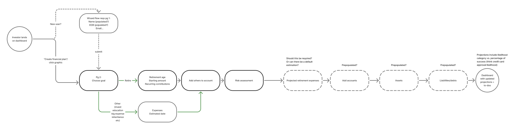
The MVP pathway was pared down to focus on Retirement planning, and the onboarding content would go on to be even further reduced
Quick wins
I used my own experience as a retail investor to determine the most likely data that could generate a progress chart: income, cash saved, frequency of deposits, and risk tolerance. I validated these data points with my product counterpart, who confirmed that those points are necessary to generate any sort of projection with a financial model.
With this knowledge in hand, I tallied the new required onboarding screens to only three short pages, with a total of six data points among them. The original experience hovered closer to around 40 different required form fields. By substantially reducing this level of absolutely required data, we theorized we could alleviate the high risk of drop-off.
I also made specific content recommendations, including the type of language and the built-in numerical scoring around the client’s financial “health” and viability of accomplishing their goals. I reasoned that getting a seemingly arbitrary percentage score was unlikely to give clients a clear understanding of meeting their goals.
A great start to this multi-party partnership
As with many projects in a large financial institution, the project is still in progress for full deployment, with plans for a beta group of USAA advisors and their clients.
The quick turnaround I gave on this mobile-first effort was significant for this partnership, and I look forward to learning more about consumer behavior and feedback to continuously improve this area of the advisor’ experience.