
Product Designer
specialties in fintech, SaaS, CRM
︎ home
︎ about

About
Snowcrash is a brand new NFT platform catering to musicians, visual artists, and corporate clientele. The brand-new website needed to provide an intuitive experience for brand new crypto consumers while still appealing to a web3-familiar audience.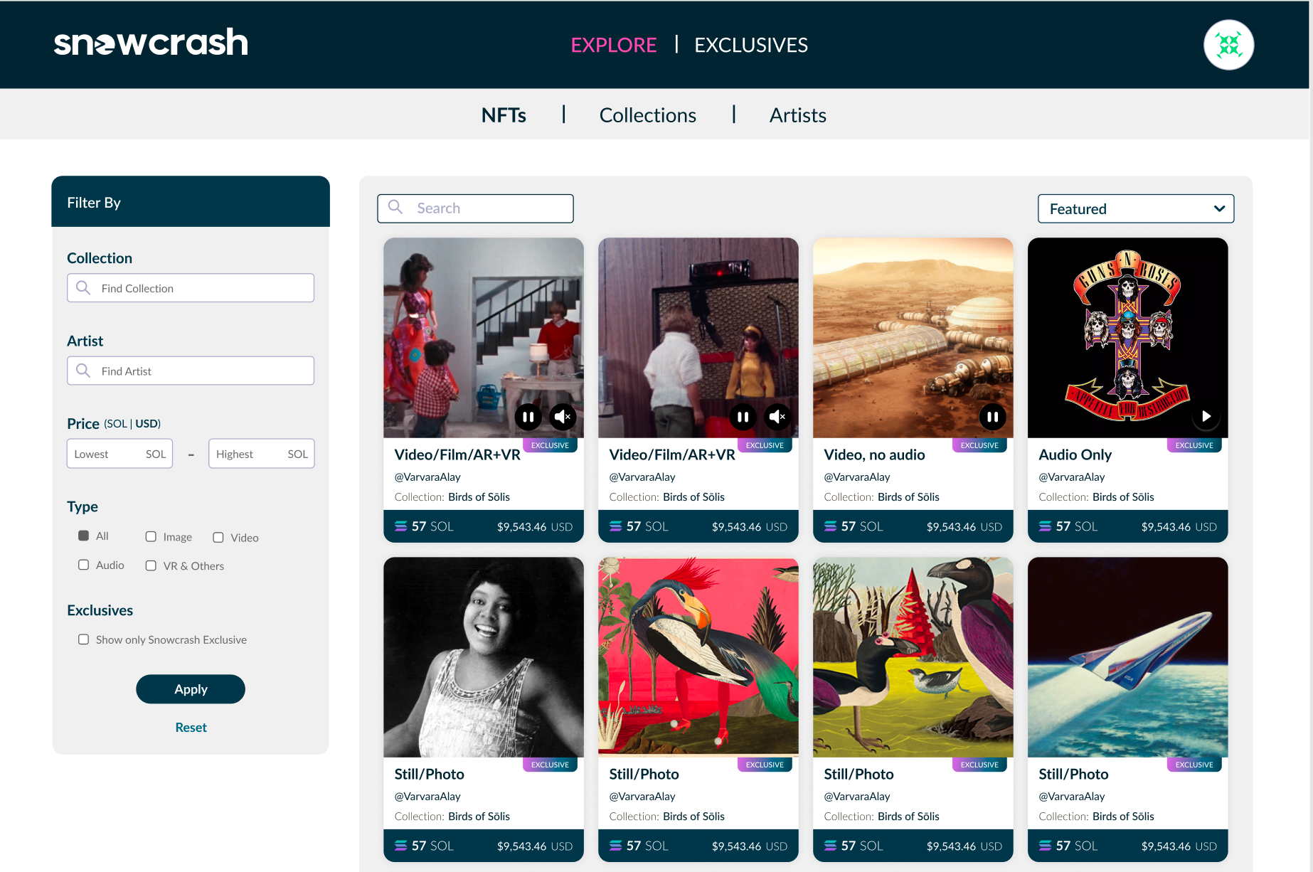
Goals
- Research and determine the most important flows for users in the platform while meeting business reqs
- Deliver main flows and final screens for MVP site with consideration for scaling
- Create an “early days” design system to support primary use cases and quick builds of new pages
Research
Research involved review of design interactions and patterns by leading web3 platforms, along with other popular e-commerce and financial services platforms. For the MVP launch, my product manager and I opted to consider the consumer (i.e. NFT purchaser) as the main user, as in these early days our enterprise clients would receive hands-on pitches. For reaching consumers as well as clients, I chose standard design elements in web3 space, including carousels, featured moving (video and gif) imagery, and easily accessible explainer content.
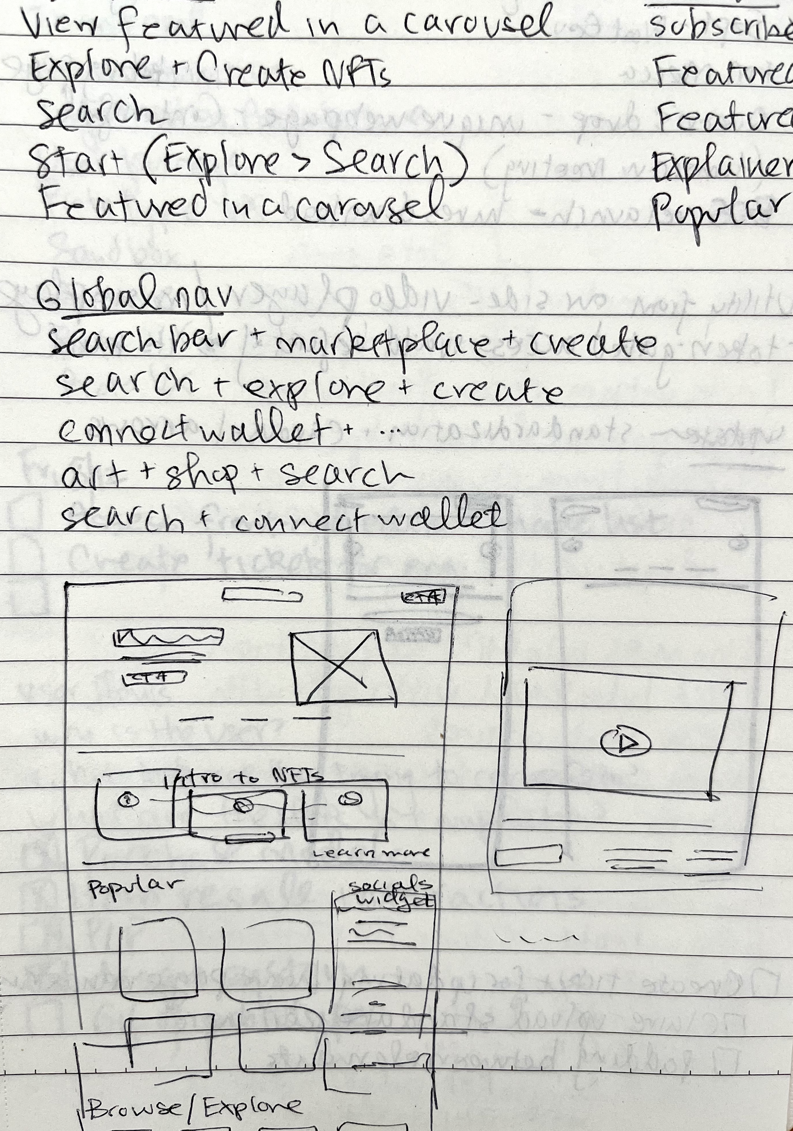

Sketched UI, interaction patterns
Consolidated notes of industry UI patterns
User flows & UI
The MVP user flows for Snowcrash included new user registration, purchase of NFT items from artists, and browsing/purchase from the secondary sale market.1. Sign-up + sign-in
The user registration flow reflects the need for web3 users to “verify” their identities in order to begin any transactions. The level of verification needed for a collection depending on the compliance requirements of the selling artist/client. The standard for web3, however, is to use wallet login as a key identifier.

Visualized user flow of user sign-up and sign-in (Figjam)
2. Sign-up + sign-inClosely tied to the login flow is the purchase flow. A dynamic element of these pages includes the practice of presales and public sales and users needing to claim “allow list” tokens where applicable.
Because web3 consumers are typically permitted to browse the collection overview pages without having to sign up, we wanted to make a last-minute registration ahead of a sale as smooth as possible. As sales can feel urgent with others claiming limited quantities of these items, we wanted the steps to successful completion to be clear, even with a very complex back end working at top speed.

Visualized user flow of purchase via presale or public sale (Figjam)
We knew wallet login would be a crucial requirement for many consumers, yet I also wanted to highlight the availability of email login, necessarily coupled with fiat payments, made easily available within the “purchase” button interaction.
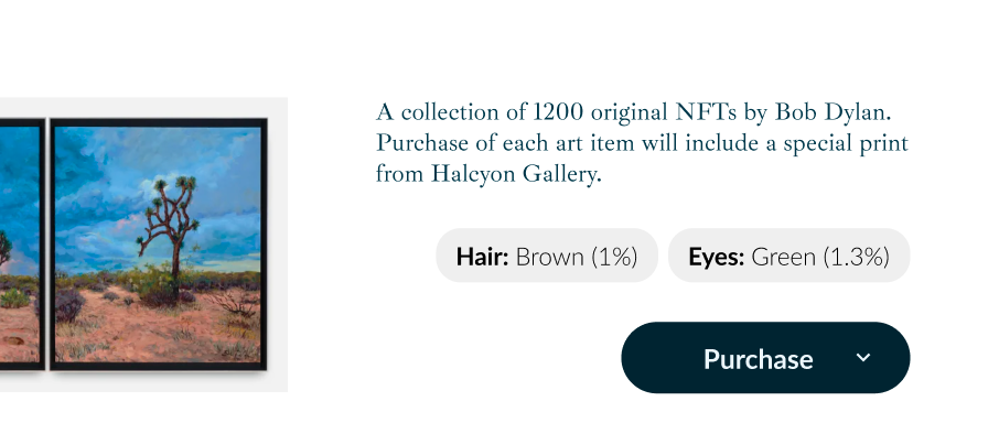
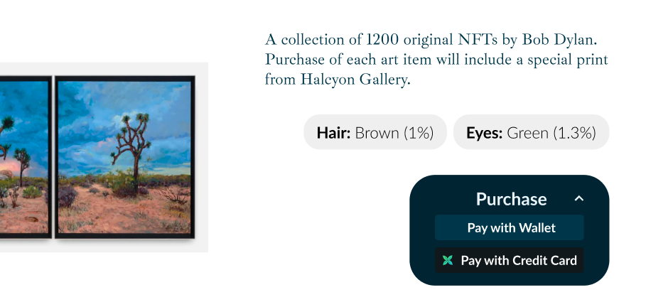
Dropdown button mockup allowing multiple purchasing methods
3. Browsing & buying on resale market
This last flow would be similar to the primary purchases seen above, but would focus on a product listing page instead of a branded landing page. Additionally, users would themselves be able to list their own purchased items for resale.
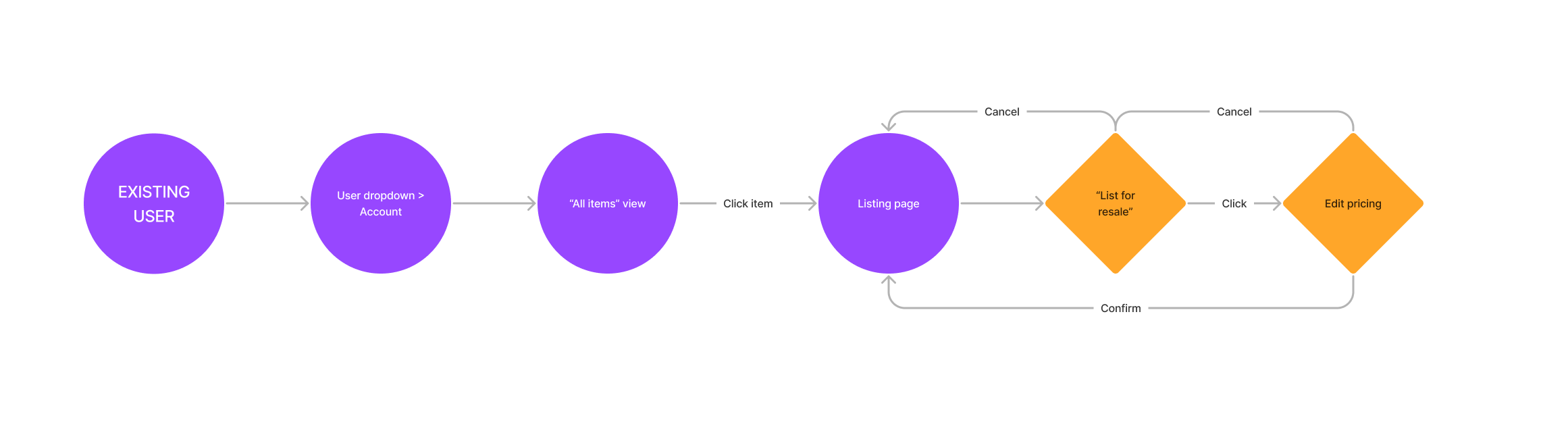
Visualized user flow of viewing purchased items and listing for resale (Figjam)
For the “market” side, we opted to follow e-commerce closely with simple filter menus, grid views, and symbols to convey the types of media on offer. For the resale interactions, I wanted to maintain simplicity and recall (rather than learning a platform-specific resale process) and chose to house the steps within the item’s sale page.
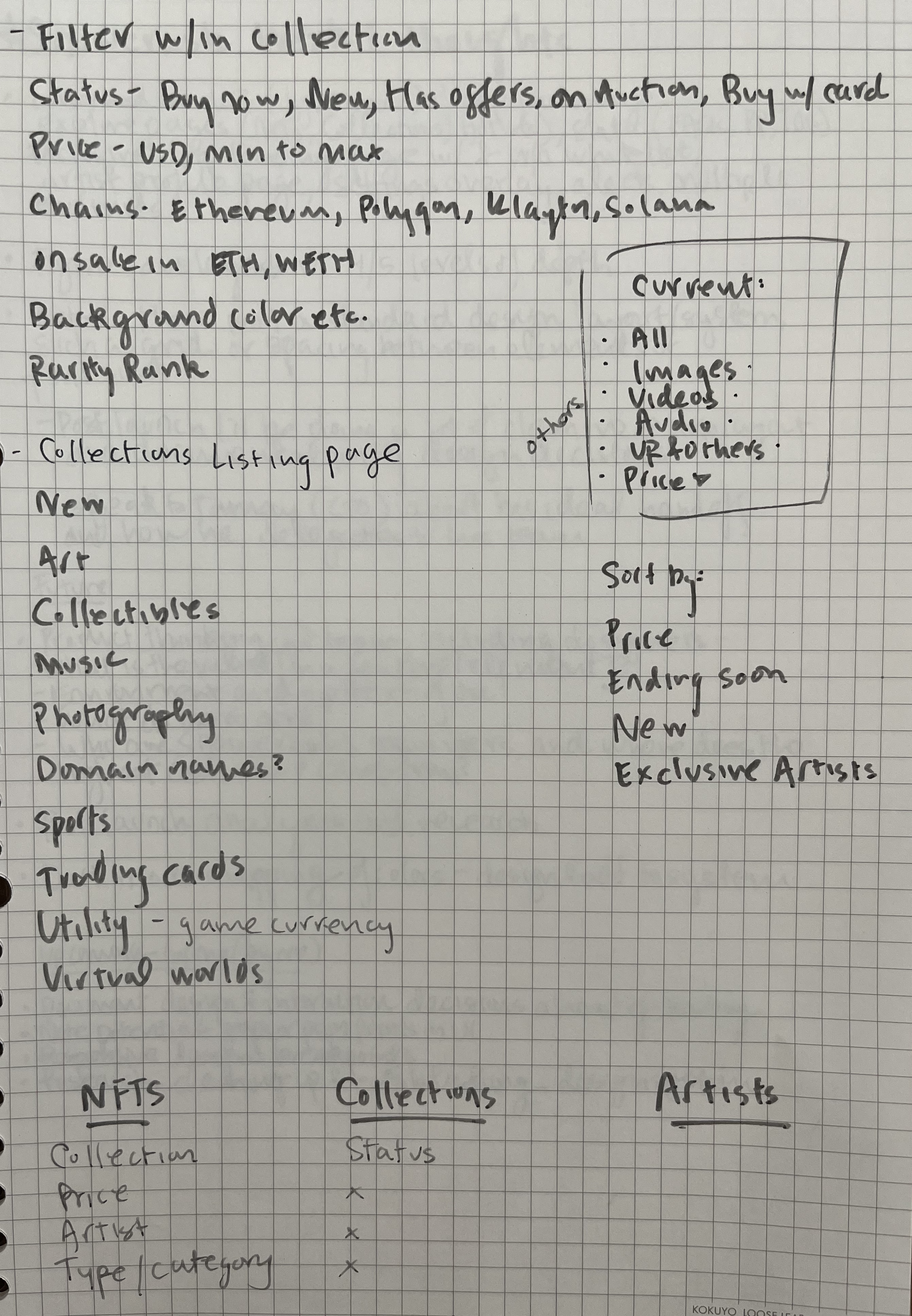
Noting requirements for secondary market page ahead of sketching
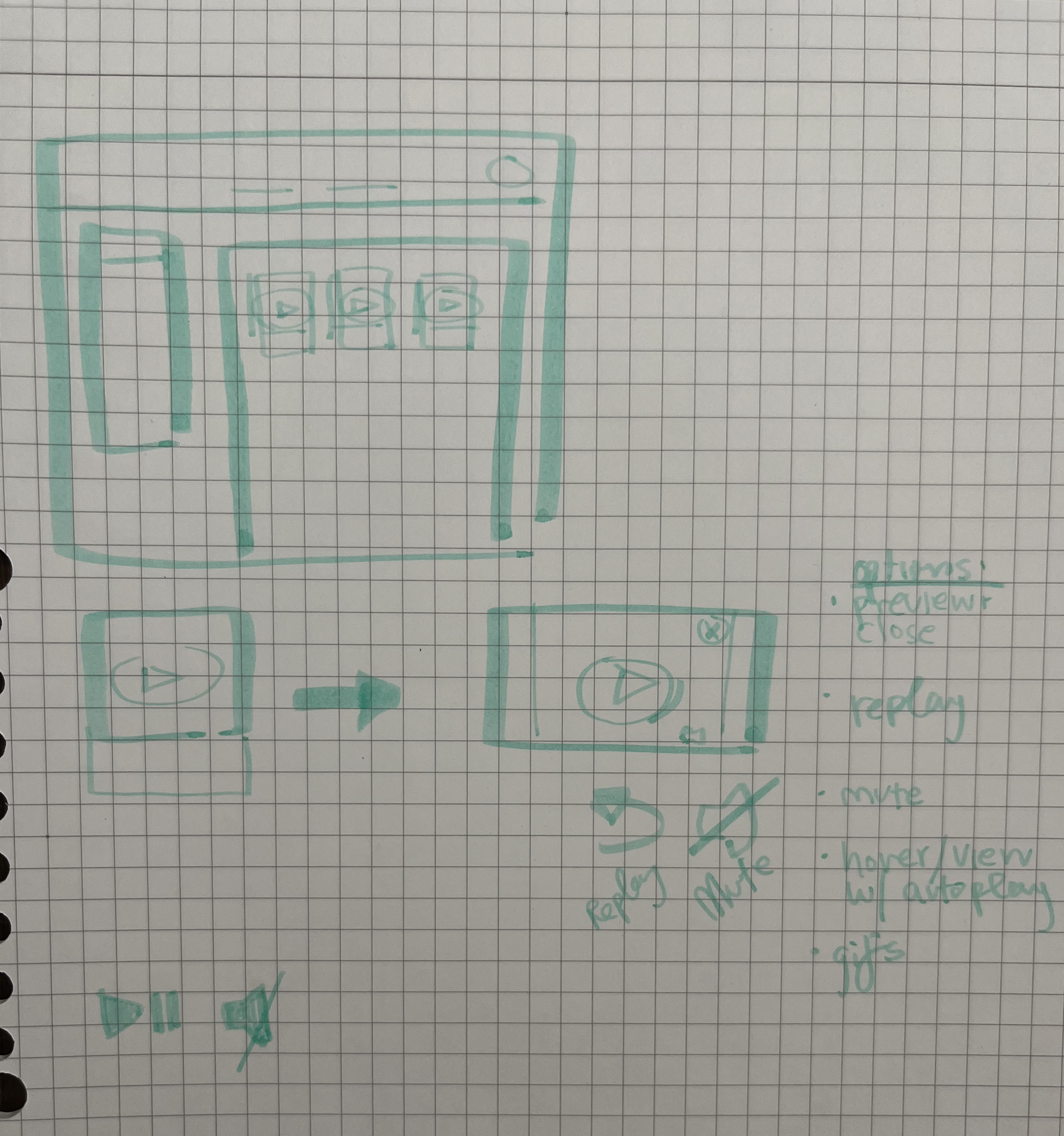
Sketches of PLP with different media types
PLP mockup
Style Guide
While MVP demanded quick production without a fully determined design system, I worked closely with two of our front end developers to make the component library and all hand-off elements easily inspectable, along with a simple guide that could live outside of Figma for quick reference of styling and spacing layouts on an 8-pixel grid.
The component library and resulting reference guide ended up being used across the communications team in their marketing assets, in addition to laying the groundwork for a more dynamic code library.
The component library and resulting reference guide ended up being used across the communications team in their marketing assets, in addition to laying the groundwork for a more dynamic code library.

Style guide elements for reference in handoffs and collaborating
Final Screen + Next Steps

Looking back on this dash to MVP, I can see how many complexities can get missed even in normal flows, much less edge cases. If we had more time and decision-making power, I would have invested much more time with usability testing. I believe that would have solidified internal consensus on designs, as well as given all teams a better understanding of our users. In future I hope to implement a regular cadence for testing and screen recordings review to create backlogged issues for resolution.