About
The Finance of America Reverse Marketing team requested designs for a campaign of dynamic landing pages targeting their borrowers/consumers. If successful, these landing pages would serve as the baseline for lead generation numbers as well as the design template for future campaigns.
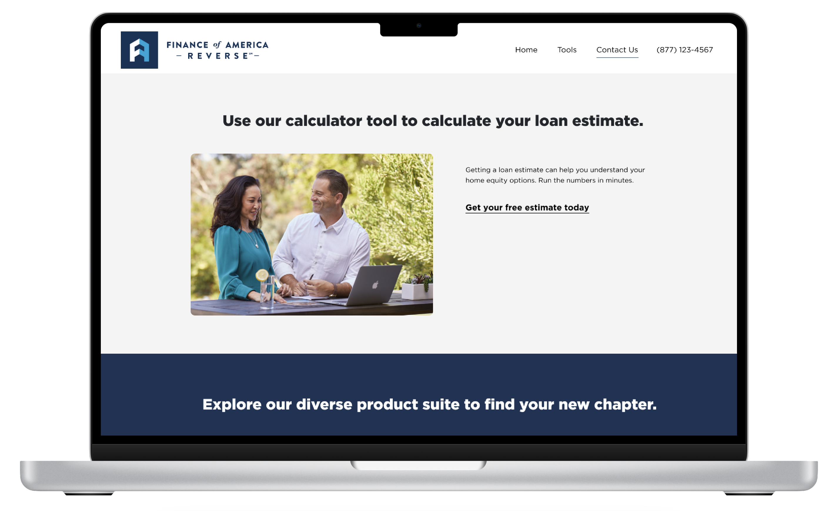
One landing page design that encouraged interaction for the customer
Goals
- Review notable patterns from previously successful landing pages
- Design and build responsive layouts (with HubSpot tools), with key heuristic elements in mind for each particular product
- Interpret the analytics and provide relevant recommendations to the Marketing teams
Previous landing pages that were tracked averaged around 3-6% conversion, lower than industry standards.
On a technical level, the existing pages were also individually hard-coded by developers in Wordpress on an ad hoc basis. These layouts also weren’t necessarily built to be responsive across devices, so some confusion or missed clicks resulted.
Research
I reviewed existing internal research on FAR’s customers and their attitudes towards the brand and reverse mortgages in general. The research highlighted some specific mindsets toward the loan product, including: anxiety towards preserving and/or improving their quality of life; fearing the bank would seize their home; or dislike for the “last resort” emotion that this loan product could convey.Other generative research included review of the most up to date industry standards for landing pages across devices and browser types. This helped to provide a target range for each page’s conversion rate.
In this stage, I also worked with the brand designers to source the correct assets to be used for the pages; spoke to directors and project managers regarding the most important value proposition for each product or campaign; and confirmed with the brand copywriting team that my original copy and UX writing from these conversations was on brand and accurate
Sketching
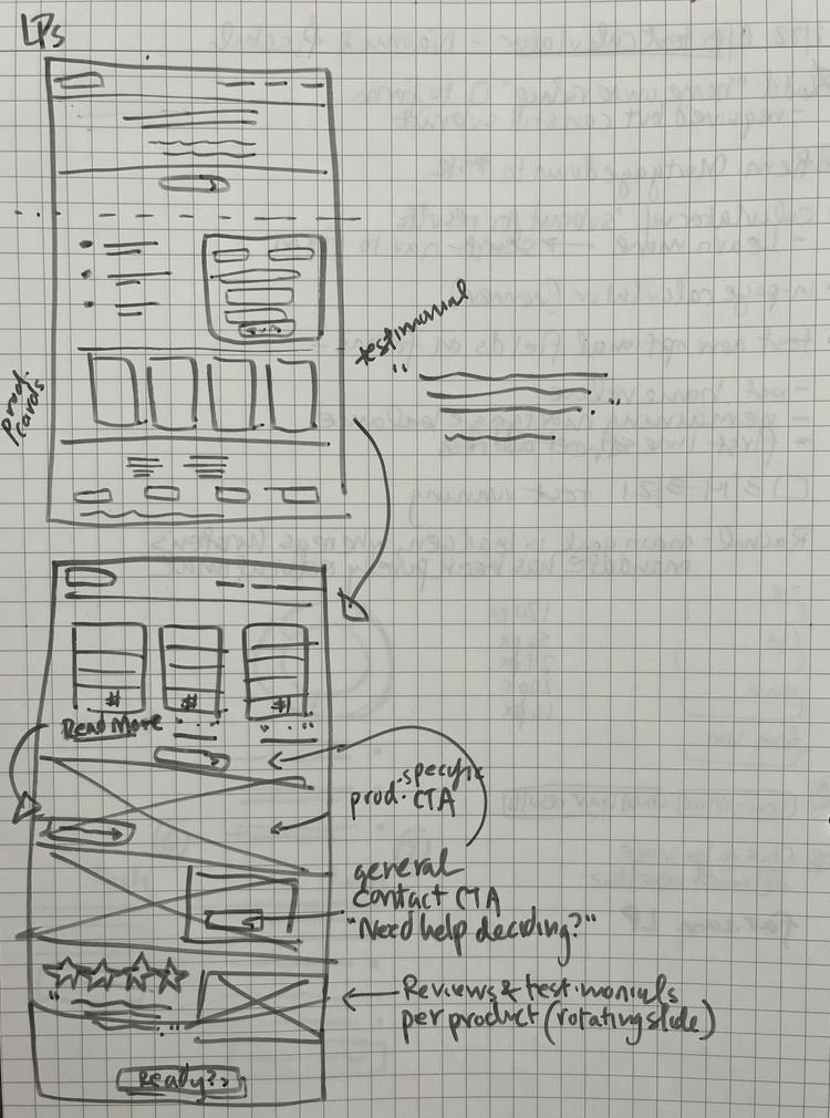
With the research as context, I determined that the landing pages needed to immediately appear soothing and assuring to consumers. Rather than creating an overtly “lead gen” page with a long-winded pitch, I opted to create a “microsite” with navigation and link styling similar to the main brand site to booster visual continuity and brand recognition.

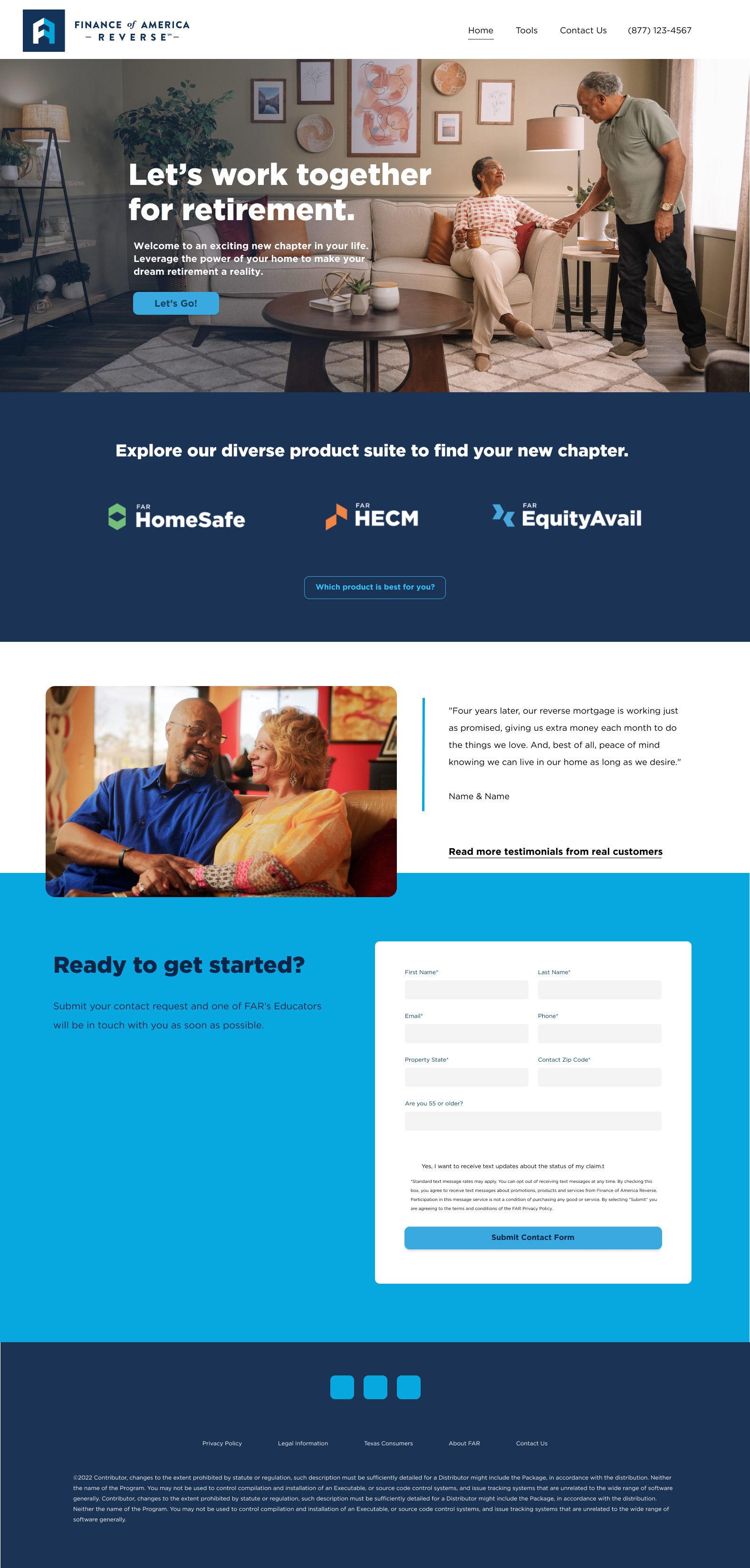
With all this, I created mockups of several templates in Figma, presented to brand team for approval, and then built the series of pages in Hubspot.
Final Designs


Results


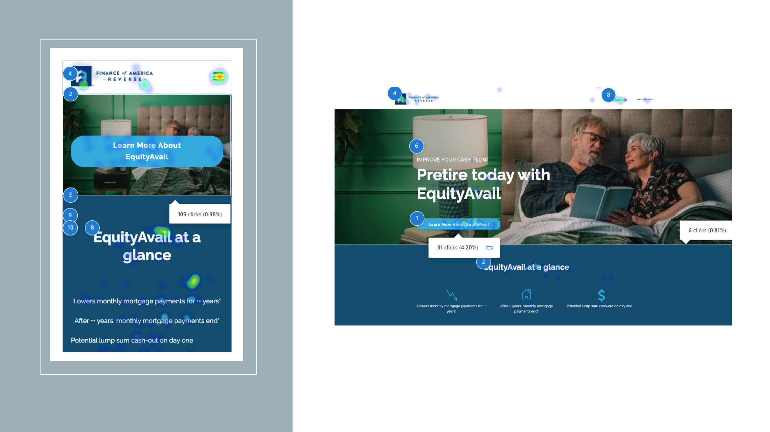
The Hubspot-built landing pages were meant to serve as a baseline for beginning to measure metrics as well as in-page behavior. The results showed the pages were largely successful on nearly all goals for the marketing team.
- The built-in analytics made reporting in real time much smoother, which helped for my user behavior reviews and any quick adjustments or bug fixes.
- More original pages were able to be built and at a higher pace, making it possible to use fresh or relevant content more frequently.
- Most importantly, new quality leads were coming in regularly and at a high conversion rate on top-performing pages (6.94% - 13.06%).
With this initial campaign deemed an immediate success, with conversion and contacts surpassing any previous landing page performance, more budget was able to be allocated to building landing pages and with additional customized layouts from in-house developers.

