
Product Designer
specialties in fintech, SaaS, CRM
︎ home
︎ about

About
OG.Land is a new brand intending to eventually encompass multiple metaverse products and collaborations with various artists and musicians. The logo, requested by Snowcrash executives for a collaboration with streamer NeonSniperPanda, needed to work across devices and screen sizes and look and feel like part of the metaverse.Design Explorations
As I do with all visual asset work, I first started sketching on pen and paper (but alas, these sketches were probably tossed/recycled).I wanted to get a feel for the shapes and moods that could be conveyed from the simple forms themselves, especially with the brand name being as nebulous as it was.
After sketching, I spent some time reviewing contemporary brands that could have similar potential target audience. These brands included some in the web3/metaverse space, musicians, and streetwear brands.
This initial research also showed me that there was a similarly named clothing brand (“Ogland”) that had a minimal design aesthetic, so I wanted to ensure our brand could be distinguished in a cursory search.
After narrowing down the primary moods and message I wanted to get across, I started exploring type styles and creating vectors in Figma.
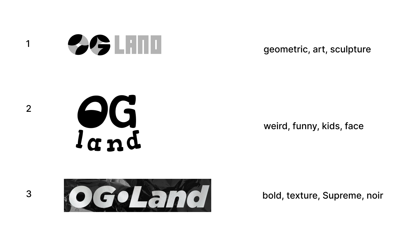
The design explorations yielded even further direction, and I chose the top three that I considered strong enough to potentially carry a new brand into early stages. I presented these three to peers (some design, some not) and asked for initial reactions and for them to describe the “tone” of each in a couple of words.
The design explorations yielded even further direction, and I chose the top three that I considered strong enough to potentially carry a new brand into early stages. I presented these three to peers (some design, some not) and asked for initial reactions and for them to describe the “tone” of each in a couple of words.
Color Palette
With the color palette, I wanted the ability to convey confidence as well as youthful boldness. The primary brand colors gave a strong foundation, while the secondary colors could provide a big contrast or a specific call to action.
Final Designs & Deliverables
With brand colors chosen, I opted to mock up the remaining “finalists” to help determine my top recommendation. And I found that the vector logo was able to hold its own with the brand’s punchiest colors, as well as read legibly against dark mode background colors.Along with the final design files and color palette, I provided a deck to the client that included my research, thought process, and suggested renderings and interactions. Next steps will be determined by the client and involved internal stakeholders.