
Product Designer
specialties in fintech, SaaS, CRM
︎ home
︎ about

About
The San Diego Association of Governments is a local government body mandated by the state to maintain a public site that houses a report called the Regional Plan. The “San Diego Forward” site’s interface needed a redesign with updated IA and updated visual branding. Problems & Goals
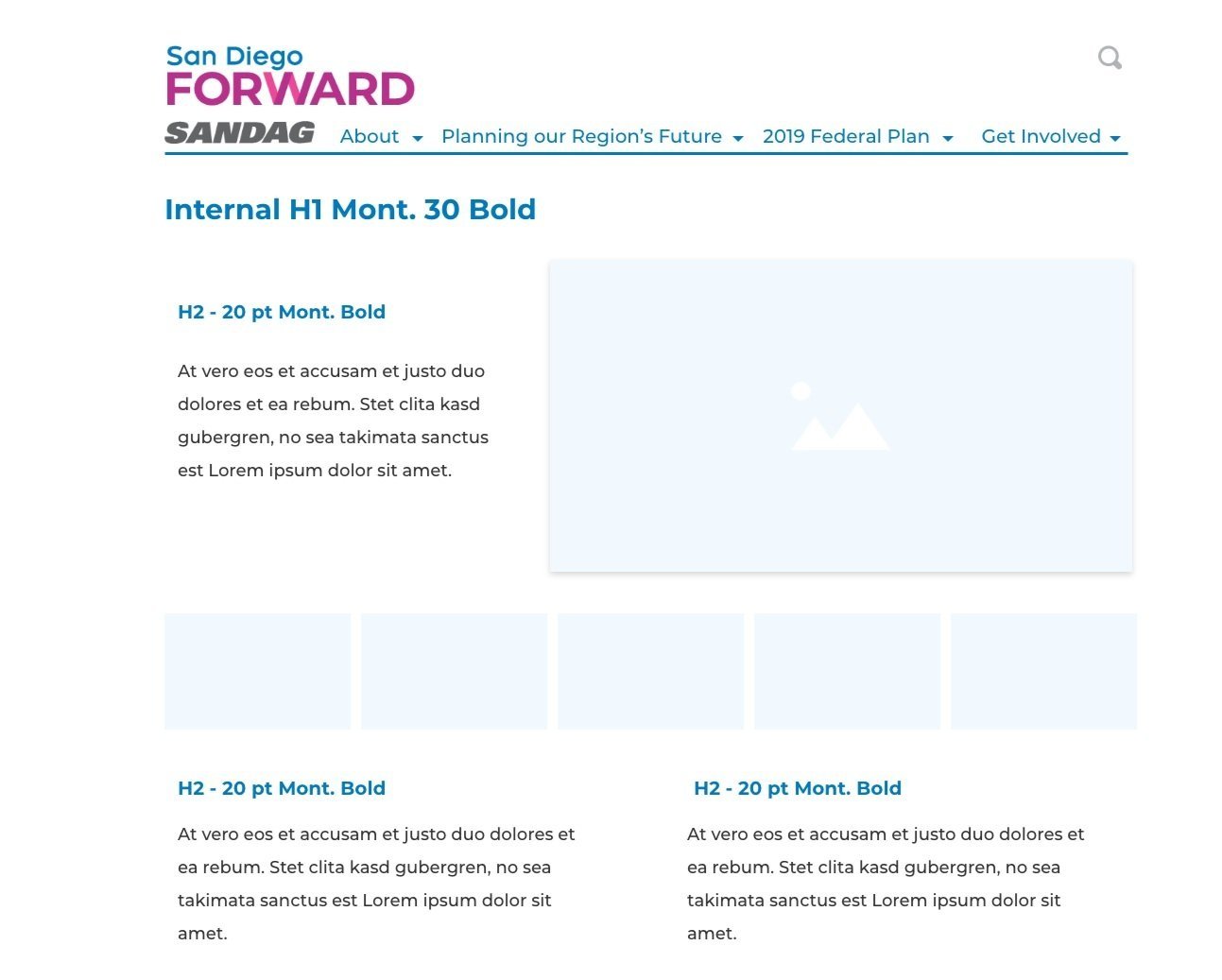
As the San Diego Forward site was going to be heavily advertised to residents across the county for the updated report’s reveal, the site needed to provide intuitive user flows to help guide the broad demographics of the region find the information they wanted.Internal usability tests were conducted with some staff that were not involved with the Regional Plan report or the site build. Most staff spent a lot of time scrutinizing each navigation option and its nested page titles. When they were able to find the page they were looking for, the content was densely packed into the viewport, causing visibility and comprehension issues.

Previous San Diego Forward design (circa 2018)
The goals for the redesign became to:
- Refine content categories and descriptive labels for an intuitive user flow
- Update copy and contrast for broader visual accessibility
- Create responsive designs for different device sizes
- Update the visual styling to include newer SANDAG brand styling
Solutions
My practical solutions involved heuristics and accepted practices for how readers consume content online. The character limit for each line needed to be reduced, along with the number of columns in the page. And the color palette could be reduced to the primary brand colors and plain black and white.
These adjustments, simple as they were, along with bringing each page into ADA compliance, made the site look more up to date and trustworthy.